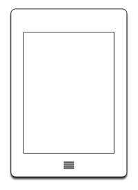
Small, grey iPads
Lukas Mathis on the design of the new Kindle Touch:
If you were to design a piece of hardware that was only used for one single task, to read books, how would you design it?
If you look at the iPad, it’s clearly a device that is not meant for one specific task. It’s just a frame; the application you run on it defines what the device does. That’s why the iPad barely has any hardware buttons. What buttons would you add that would be useful to most iPad apps? Even the volume buttons are of questionable use; most apps don’t need them, or provide their own on-screen volume control.
But a device you use for one very specific thing, and one thing alone, is an entirely different proposition. Since you know exactly what people will do with it, you can design the hardware specifically for that task.
So why, then, do the new Kindle Touch devices look like small, grey iPads?
